

Reviewed and updated 20 July 2026
Hello!
Welcome back to another paid post. Today, we will be diving deeper into the U.S. Treasury market, by examining Butterfly trade structures.
As I’ll show, there are statistically significant serial-correlation patterns in parts of this reported yield data.
Let’s get into it.
Bond Investor Expectations
Before we go into my own analysis, AQR has an interesting paper on bond investor expectations. Data shows that bond investors are naturally contrarian. They usually expect mean reversion, meaning if rates have been falling, they bet on them eventually rising back to a “normal” level. Because bonds are quoted in yields (which are forward-looking), investors tend to focus on where rates should be rather than just following the recent price trend.
However, this contrarian mindset hasn’t actually matched the data over the last two centuries. Historically, bonds have actually shown positive decadal autocorrelation, with a correlation of +0.5 since 1800 and +0.6 since 1900.
This means that bond returns have tended to continue in the same direction over long periods rather than reversing. You can see the forecasts of bond investors during various historical periods below.
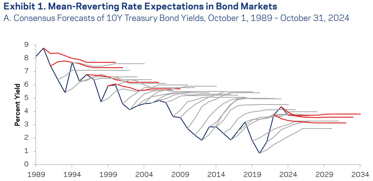
Despite this historical trend of continuation, experts and the market have stuck to mean-reverting expectations. This led to the “folly of forecasting” seen from 1981 to 2021, where economists repeatedly predicted rate hikes that never happened as yields drifted lower for 40 years.
While these expectations of a reversal made sense at the time, they were consistently beaten by a secular downtrend from 1981 to 2021.
As we will show below, bond yields do not always exhibit mean reversion (even on short time periods!).
The Treasury Flies Analysis
The yield curve gets a lot of attention (usually as a recession indicator for non-bond guys, like looking at the 2s10s spread). But fixed income professionals spend far more time thinking about curve shape than simple slope, and one of the cleanest tools for doing that is the butterfly spread.
This post walks through the full analysis: where to get the data, how the butterflies are calculated, what serial correlation appears in the reported yield changes, and what happens after the 2s5s10s spread first enters an extreme rolling Z-score.
The Data
All the yield data comes from the Federal Reserve’s FRED database. I pull six maturities: 2Y, 3Y, 5Y, 7Y, 10Y, and 30Y. You will need your own FRED API key to run the research companion. It is simple to set up.
FRED reports these yields in percentage points. I multiply the calculated yield-spread differences by 100 to express them in basis points, which keeps the numbers intuitive. This is a curvature measure in yield space, not a DV01-neutral trade.
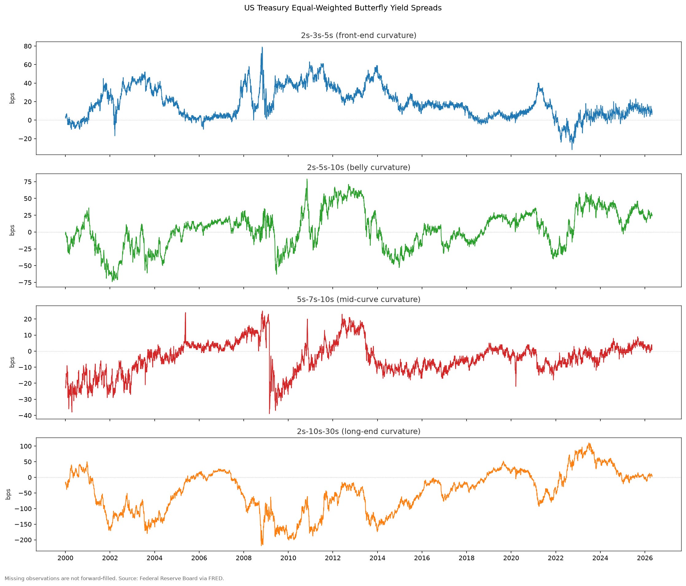
Looking at the historical time series, the four equal-weighted yield spreads behave differently. The 2s10s30s long-end spread has the largest swings in total basis points, while the front and intermediate spreads are generally tighter. The 2008 financial crisis, the 2020 COVID shock, and the 2022 hiking cycle all coincide with large changes in at least part of the curve. The chart is descriptive; this analysis does not test what caused those moves.
Butterfly Structure
A butterfly spread (“fly” in shorthand) measures the curvature of the yield curve at a particular point. The formula is simple:
Fly = Y_short + Y_long − 2 × Y_belly
Where Y_short and Y_long are the yields on the wings, and Y_belly is the yield on the middle maturity. If the yield curve is perfectly linear between the three points, the fly equals zero. Positive readings mean the belly yields less than the average of the wings (the curve bows upward at that point); negative readings mean the belly yields more (the curve is concave at that point).
The four butterflies cover different curve segments. Market participants commonly interpret them as follows, although those mechanisms are not tested in this notebook:
• 2s3s5s: front-end curvature, often discussed in relation to short-rate expectations and bill/note technicals
• 2s5s10s: belly curvature, often used for intermediate relative-value views
• 5s7s10s: intermediate-to-long curvature, often discussed alongside 10Y demand and curve-steepening flows
• 2s10s30s: long-end curvature, often discussed alongside convexity, pension demand, and long-end supply
This decomposition maps loosely to what Litterman and Scheinkman (1991) identified as the three principal components of the yield curve: level, slope, and curvature. The equal-weighted yield spreads used here are simple curvature proxies. A tradable butterfly would need maturity-specific DV01 weights and an explicit implementation in cash Treasuries or futures.