

Reviewed and updated 22 July 2026
Hello!
Today, I’m sharing a strategy inspired by a market anomaly uncovered in an academic study. The paper highlights an interesting relationship between equity and bond-market volatility, leading to a simple question: can that relationship help identify days when SPY is likely to perform unusually well?
The historical pattern is present in the data. The leveraged strategy results are more sensitive: they look strong under simplified same-close assumptions, but weaken with more realistic trading timing and costs. This post explains the pattern, then tests whether it survives those stronger assumptions.
With that said, let’s get into it.
Paper Introduction
We all know the relationship between equity prices and treasury debt is complex—especially in recent times, given the influence of recent Fed decisions. But what if we used the volatility metrics of both asset classes as a predictor for equity returns?
I featured a paper titled “Divergence of Fear Gauges and Stock Returns” a little while ago. It is written by finance researchers Xinfeng Ruan and Xiaopeng Wei and was posted on October 28, 2024. This is my prior summary of the paper:
The October 2024 working paper defines its primary Divergence of Fear Gauges (DFG) measure as the residual from a regression of MOVE on VIX and presents MOVE/VIX as an alternative. In the 2026 journal version, the primary measure is instead the second principal component of standardized MOVE and VIX. The later paper reports that greater bond–equity relative uncertainty predicts lower subsequent broad stock-market returns, including in out-of-sample tests. In this post, I test the simpler MOVE/VIX ratio from the working-paper specification. It is not the journal article’s PCA signal, so the analysis is an exploratory strategy test rather than a direct replication of the journal signal or its numerical findings.
I’ll test this simpler ratio, see how it performs, and determine whether there are any opportunities for improvement.
Methodology and Data Analysis
This paper doesn’t outline a clear strategy but instead highlights a relationship between DFG and stock market returns, giving us more flexibility in creating a strategy.
While this allows for some creativity on my part, it may make it a bit more challenging for you, the reader, to follow the exact decisions behind this strategy’s development. To address this, I’ve outlined the broad methodology below, but please feel free to reach out with any questions.
Data
The first step in my investigation was importing the necessary Python packages and retrieving the data from Yahoo Finance. These tasks were completed in the first two cells of my Jupyter Notebook.
I pulled available daily closing-price data for the VIX, MOVE, and SPY in the 2003–2024 window.
I use SPY and the S&P 500 interchangeably in this post.
Data Analysis
With the data in hand, I created a graph to visualize the relationship between the S&P 500 (as tracked by the ETF SPY) and DFG over time.
For this analysis, I define DFG as the ratio between the MOVE index and the VIX, calculated as MOVE / VIX. This is the simpler alternative used in the October 2024 working paper, not the 2026 journal article’s PCA-based primary measure.
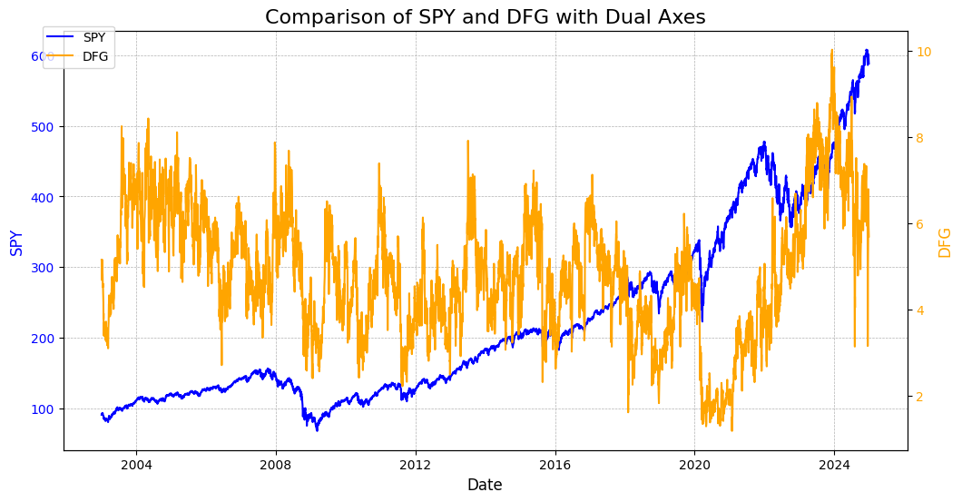
This initial graph is admittedly quite messy, and there doesn’t appear to be a very clear relationship. However, one notable observation is the sharp decline in DFG during the 2020 COVID-19 crash, followed by a gradual increase in its value since then. This pattern is likely driven by the spike in the VIX, which, as the denominator in the DFG calculation, caused a significant decrease in its value.
While this visualization didn’t provide much actionable insight, let’s try another approach to uncover potential relationships.
Next, we’ll examine a scatter plot with DFG on the x-axis and SPY’s return at the next date shared by SPY, VIX, and MOVE on the y-axis.
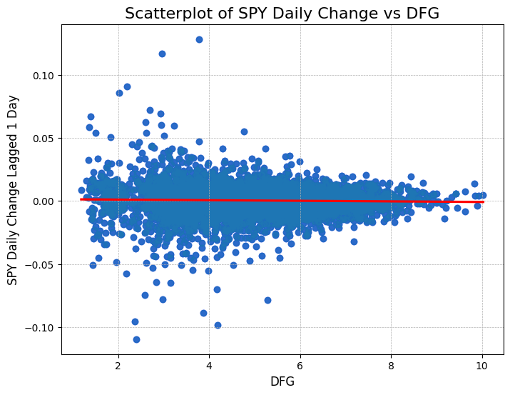
Once again, the relationship is weak. The fitted line slopes slightly downward and is statistically distinguishable from zero in this historical sample, but it explains less than 0.1% of the variation in next-common-observation returns. That is not enough, by itself, to support a practical strategy.
Alright, let’s try one more visualization. This time, we’ll group DFG into equal buckets based on its values and calculate the average return of SPY on its actual next trading day. To provide additional context, we’ll include a horizontal line representing the average daily return of SPY, allowing us to identify whether any of the DFG buckets produce meaningful deviations.